Design Justification

layout

The brand HOPPER is created by people who understand and value the power of the individual to be unique and beautiful on their own. Therefore, we wanted to create a website that represents that in the best and clearest way possible. Everything in our website from the color palette we used to the tiny details like the paddings and margins has been carefully thought out by our amazing team.

COLORS

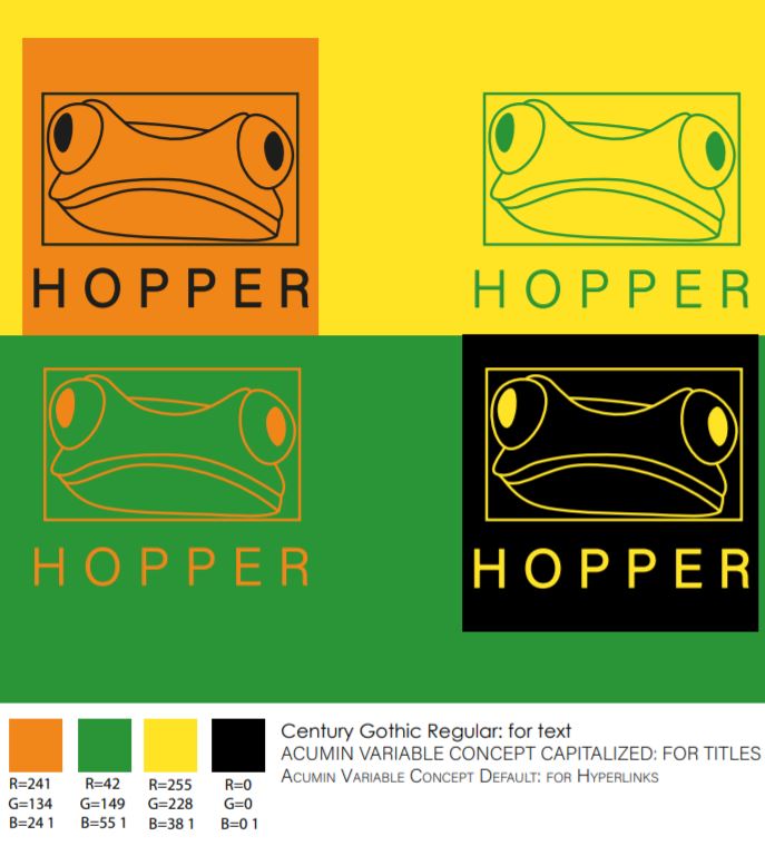
We used the same color palette that you can find in HOPPER's brand roadmap (the color codes are also to be found in there). We wanted to use bold colors that make our users feel like they can be in their true and authentic form when shopping in our website, that make them feel safe, but also excited to see what we offer. The orange we used is a warm tone that symbolizes enthusiasm and joyfulness, the green stands for creativity (which is also one of our values) and the yellow stands for happiness and friendship (which is also something very important we want to achieve with our brand – creating a community of people). Black and white were the colors we were using to create a beautiful contrast in our website, while preserving the general feeling we want to portray to our consumers.

SHAPES

Of course, it was very important for us to create the feeling of harmony in our website, yet still keep the boldness of it, which is why we decided to include the background of orange and green lines, which combined with our yellow footer, created the perfect symmetry (yet a bold one) that pleases the eye - it made it more coherent.

HIERARCHY AND SIZE

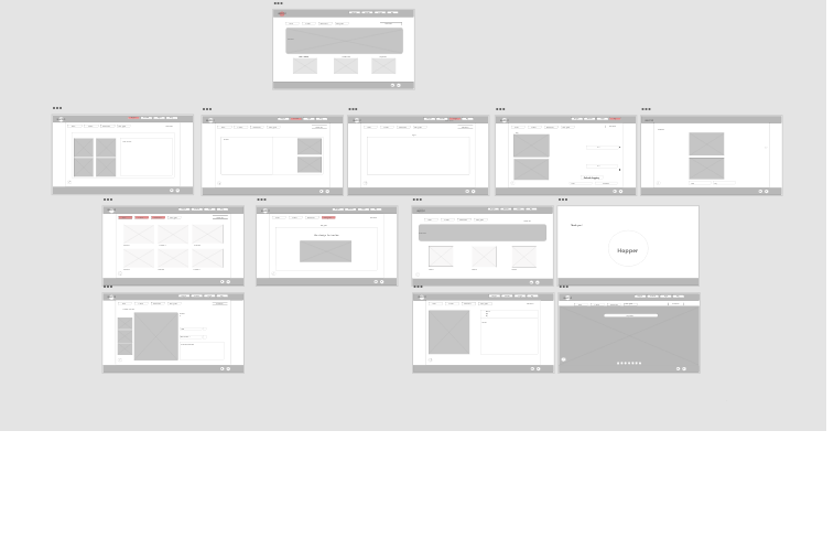
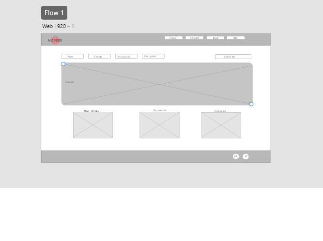
Another important aspect that we didn't forget about was the hierarchy of elements in our website – in our main (home) page one can observe how we emphasized on the important elements like "Shop here", "The future is fluid" and "What we believe" in order to draw attention to them. Together with them, we also added the smaller text element under "What we believe" where we explain what we stand for. The white space around it also gives the feeling of highlight (laying emphasis on that section), which we thought was quite important to have in our home page. The ratio and size are also something we played around with in our home page – the section with the pictures for shopping for trousers, t-shirts and merchandise is a little larger than the rest of the elements, which we thought gave off a good feeling of "going outside of the box", which our brand is all about.

NAVBARS

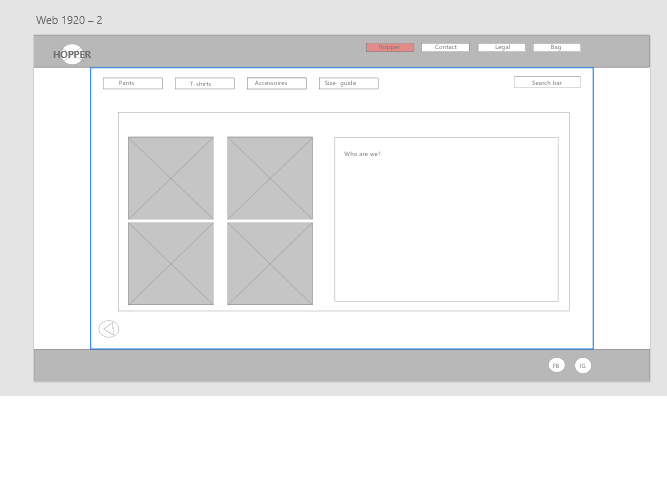
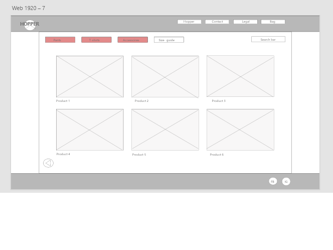
The decision to have two navbars was quite easy – we wanted to make it as easy for our customers as possible to go to our shopping page, which can be accessed from the "shop now" button, the pictures on the home page, and the small navbar. Meanwhile, the big navbar is where all the important information is when it comes to contacting us, legal issues and a bit more insight on what HOPPER stands for, which we thought would be interesting for our customers.

LESS IS MORE

We didn't want to preoccupy our website with unnecessary items, because we wanted to make it seem like it's "easy to breathe" with our brand and everything is exactly where and when you need it – this is why we have lots of white spaces all around or pages (when appropriate, of course) and we tried to keep it consistent with that. We also really tried to give off the sense of continuation with the shapes we used for our products, for example (also in the shopping cart page).

FONTS

The HOPPER website is also making use of a consistent font, which sadly couldn't be the same as the one in our brand roadmap (due to licensing issues of the font), however we did make sure that the fonts we used both in the roadmap and in the website still carry a meaning. We chose fonts that were as neutral as possible (not too feminine and not too masculine), yet ones that beautifully made our messages stronger. 

Fonts used: Acumin Pro (for titles h1-h5) Century Gothic (for text/p)

The HOPPER website is also making use of a consistent font. We made sure that the font we used in the roadmap and in the website carry a meaning. We chose fonts that were as neutral as possible (not too feminine and not too masculine), yet ones that beautifully made our messages stronger.

User Testing

usertesting

Indy Aponno

Please find out the mission of our brand: She had no problem finding it.

Go back to the main page: worked worked

You want to buy a facemask: she found it immediately

Find the brands phone number: she found it without any trouble

Find our Instagram account: she found it but gave the tip to when you open it to make it open in a new tab.

Other feedback: what is bag? the name is confusing. rather call it something else.

usertesting

Maxim Burghaus

Please find out the mission of our brand: he had no trouble finding it

Go back to the main page: worked worked

You want to buy a facemask: he directly went to merchandise. 

Find the brands phone number: he found it

Find our Instagram account: he struggled to find it, but then eventually did

Other feedback: -

usertesting

Lars de Rijk

Please find out the mission of our brand: could find it but asked if that was “our future”

Go back to the main page: worked worked

You want to buy a facemask: he was first going to T-shirts, but then quickly found merchandise.

Find the brands phone number and call it: he found it without any trouble. The phone number worked

Find our Instagram account: he found it without any trouble

Other feedback: "The page looks good, I like the colours and the video at the homepage. Maybe make the "bag" a bit less confusing.

    Improvements and Justifications

  • -Our participants were chosen to be within our target group, of people between 12-24. They were HBO/university students, on a creative study
  •  

  • -We have let our participants engage with different situations. Finding our instagram page, find the mouthguards, find our mission and find our phonenumber
  •  

  • -These different actions led to different pages, trying to pinpoint if our navigation was clear, also letting the participants explore our different pages and if the right path could be easily found
  •  

  • -When the participants could not find what we aked them to find, they explored the pages to find a solution and eventually found the things we asked for
  •  

  • -Most of the actions we asked them, they found. Nobody had a problem with the phonenumber so that is clear
  •  

  • -Two had a little bit of trouble of finding the Instagram page, but quickly found it after looking a little further
  •  

  • -To make the Instagram page clearer, we moved the Instagram page from the content page to the bottom of the homepage, Lars suggested it and it seemed to work out a lot better and it was easier to be found
  •  

  • -Only Lars could not easily find our "mission" page so we decided to leave it the way it is. He also noticed that it was under "our future" the second we asked it. We cannot make it clearer according to brief regulations
  •  

  • -Lars told us to make the bag less confusing. So we added a picture of the product and put the pricing and delivery sepperatly from the product. Lars liked this change, when we asked him later. Said it was a definate improvement
  •  

  • -Overall the website was already pretty good according to our participants. Luckily they found some small changes for us to improve on

-Overall the website was already pretty good according to our participants. Luckily they found some small changes for us to improve on

Analysis of The Results

Analysing the results, we discovered that there were some issues with our website. We tried to also consider the 5 E's of Usability when doing so.

Effectiveness - In that regard, we believe our wirefrime appeared as effective as we hoped to - all the participants managed to find what they were supposed to, regardless of the fact that they struggled a bit with some of the tasks. The final result was there.

Efficiency - Overall, we were happy with the efficiency of how our participants handled the user testing. Of course, some things could have been imporved in that regard (for example, making a clear distinction between the "Our Future" page and our "Justification" page, as that appeared to be something that caused some confusion and slowed the process of finding the right things.

Engagingness - When it comes to engagement, our participants found the wireframe eye-pleasing, we even received some compliments on the color scheme we used for the website. However, two people found the "Bag" to be a bit confusing and not looking 'right'. She wasn't finished by the time we did the user testing, however we took some notes on that.

Error Tolerance - We believe we did quite well in that regard too, because whenever a participants accidentally clicked on a different page/title, they could (and did) instantly go back to their desired page and found their way around the website quite easily. There were, of course, a few small errors, however when it comes to error tolerance, we believed we did quite well, as all the errors that occurred could have been (and were) fixed.

Ease of Learning - We did our best to design our wireframe in a way that's easy to comprehend and "learn". We created our navigation bar for products the same way most clothing brands do it, which we found was beficial to our participants as well, as it helped them find their way around the website easily. An element that we will, however, consider changing is the two navbars, since that ended up being a bit confusing for some participants (as to where to look for what).

Suggested Improvements:

  • The two navbars - we could make them a bit more distinguishable in regard of design (for example make the main one larger than the shopping one).
  • The bag - although it is still unfinished, we will take into consideration removing the word "BAG" and putting an icon in its place instead, so that it's clearer that this is not a bags' section, but your shopping cart.
  • The overall design of the website - we could work a bit more on making the website more eye-pleasing and engaging with certain design elements.
  • A clear distinction between the "Justification" and "Our Future" pages - perhaps consider removing or renaming one of the two.

Prototype

click here for the prototype

prototype example

Here is the the whole flow XD prototype

prototype example

Example: the front page

prototype example

Example: who are we page

prototype example

Example: product page